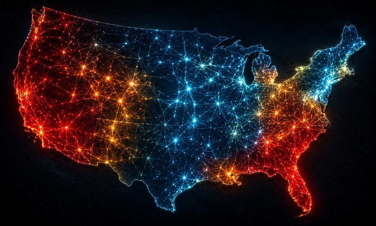
The organization responsible for the reliability of the North American power grid has already told you which regions are most likely to fail. Almost nobody reads the report. It’s public, it’s updated every year, and its most recent edition, released at the end of January 2026, quietly marks a growing share of the country in red.
This isn’t a doomsday prediction from a survival blog. It’s the North American Electric Reliability Corporation, the industry’s own watchdog, publishing a color-coded map of where electricity supply is projected to fall short of demand over the next decade. When NERC marks a region “high risk,” it means their own modeling shows planned resources won’t meet the standard for keeping the lights on under stress. Thirteen of twenty-three assessment areas across North America now carry elevated or high risk within the next five years. If you live in one of them, your grid-down preparation stopped being hypothetical some time ago, you just may not have been told.
Is your state at risk of grid instability?
Based on NERC’s own 2026 Long-Term Reliability Assessment. Select your state to see its risk level and grid region.
What “high risk” actually means before you panic
The word “risk” here is precise, not dramatic, and it’s worth understanding exactly what NERC is and isn’t saying, because the honest version is more useful than the scary one.
A “high risk” designation doesn’t mean the grid in that region will collapse. It means that under above-normal demand or extreme weather, planned resources are projected to fall short of the reserves needed, and operators may have to take emergency measure, appeals to conserve, controlled rolling blackouts, emergency power purchases from neighbors, to keep the system from failing entirely. Most of the time, those measures work. The lights usually stay on. But “usually” is doing heavy lifting, and the margin that “usually” depends on is exactly what’s thinning. The risk isn’t a guaranteed blackout. It’s that the buffer between normal operation and emergency is shrinking, so it takes less, one heat dome, one deep freeze, one cluster of generator failures, to tip a region into trouble.
That’s the shift that matters. You’re not preparing because collapse is certain. You’re preparing because the system now has less room to absorb the shocks it used to shrug off.
The regions NERC flags as highest risk
As of the January 2026 assessment, the areas carrying high risk of resource shortfalls include MISO, PJM, ERCOT in Texas, the WECC-Northwest, the WECC-Basin, and SERC-Central. That list covers an enormous share of the country. Here’s what’s driving each, because the reasons aren’t identical and they change what a resident should expect.
MISO – the Midwest’s chronic tight margin. The Midcontinent system, stretching across much of the central U.S. from the Upper Midwest down toward the Gulf, has been flagged as facing the most frequent risk of insufficient operating reserves during extended heat events. The core problem is structural: dispatchable thermal plants are retiring faster than firm replacements come online, and the grid increasingly leans on wind whose output can sag exactly when a heatwave peaks. When a large region depends on a resource that underperforms during the specific conditions that spike demand, the reserve margin gets thin at the worst possible moment.
ERCOT – Texas, alone by design. Texas runs its own interconnection, largely isolated from the two big national grids, a choice that keeps it free of federal oversight but also means that when ERCOT runs short, it can’t lean on neighbors the way other regions can. The 2021 winter catastrophe made that isolation concrete. ERCOT has added enormous solar capacity since, which helps in daytime heat, but the persistent worry is the evening ramp: solar drops off in the early evening while demand stays high, and the system has to cover that gap fast. Explosive data-center growth adds a new load variable the grid is still learning to model.
PJM – the mid-Atlantic’s demand surge. PJM covers the mid-Atlantic and parts of the Midwest and is generally well-resourced, which makes its inclusion telling. The pressure here is coming from the demand side: surging load from data centers and industrial growth colliding with generator retirements, tightening reserves that used to be comfortable. When even a well-resourced region shows up on the risk list, the driver is usually the same one reshaping the whole grid, electricity demand growing faster than firm supply.
The Western risks – WECC-Northwest and WECC-Basin. The Great Basin and Pacific Northwest assessment areas face forecasted load growth colliding with planned generator retirements, with the Basin’s risk escalating later in the decade. The West adds its own stressors: wildfire risk that can force precautionary shutdowns, extreme heat, and a heavy reliance on inverter-based solar and battery resources whose behavior during system disturbances is still an area of active concern.
The thread running through all of them is the same, and it’s more important than any single region: demand is climbing steeply, NERC projects continent-wide peak demand rising by well over 200 GW in the next decade, driven heavily by data centers, while the dependable, always-available generation is retiring faster than it’s being replaced. That’s not a regional quirk. It’s a structural squeeze showing up first in the regions with the least slack.
Why the map is spreading, not shrinking
If this were a temporary problem, you could wait it out. It isn’t, and the reasons it’s growing tell you this is a decade-long condition, not a bad season.
Three forces are converging and none of them reverses quickly. Demand is surging in a way the grid hasn’t planned for in generations, led by data centers and AI infrastructure whose appetite for power is enormous and concentrated. At the same time, dispatchable generation, the coal and gas plants that can be turned up on command, is being retired on a schedule that’s outpacing firm replacements, to the point where federal emergency orders have repeatedly forced retiring plants to keep running just to hold the margin. And the new capacity that is being added is heavily solar and wind, which are clean and cheap but variable, producing power on the weather’s schedule rather than on demand’s. Building the transmission lines and storage that would smooth that variability runs into permitting delays and supply-chain constraints that stretch for years. Notably, the interregional transmission that lets a stressed region borrow from a healthy neighbor represents a shrinking share of planned projects, meaning the safety net between regions is thinning even as the regions themselves get tighter.
None of that gets solved in a year. The result is a map that trends toward more red, not less, and a grid that operates with progressively less cushion against the extreme days.
What this actually means if you live in a flagged region
Strip away the drama and the practical takeaway is narrow and clear. You are not being told the grid will fail. You are being told, by the industry’s own analysts, that the region you live in is running with less margin than it used to, and that the failure mode isn’t a dramatic collapse but the quiet, increasingly likely rolling blackout during the exact conditions that already make life hardest: the peak of a heatwave, the depth of a cold snap.
That reframes what preparation means. The threat here isn’t the year-long, transformer-destroying catastrophe of a solar storm or an EMP. It’s the far more probable event of losing power for hours to a few days, during dangerous weather, with a decent chance it’s a controlled outage the utility imposes to keep the whole system from going down. The preparation that matches this is unglamorous and specific: enough water and food to ride out several days without a resupply run, a way to stay warm in a winter outage or cool enough in a summer one, backup for anything medical you depend on, and, the piece most people skip, a source of power that doesn’t die when the grid does.
Because that’s the quiet lesson under the entire NERC map. The people who are fine during a rolling blackout aren’t the ones who stored the most; they’re the ones whose critical functions don’t depend on the wall socket staying live. When the margin is thinnest during the worst weather of the year, the difference between an inconvenience and an emergency is whether any part of your home can generate its own power while the grid sorts itself out.
The report won’t warn you personally
Here’s the part worth sitting with. All of this is public. NERC publishes it, updates it annually, and the regions in red are named in plain language. There’s no hidden knowledge here, only the fact that almost nobody reads a reliability assessment until they’re already sitting in the dark, and by then the report has stopped being useful.
Look up which assessment area you live in, MISO, PJM, ERCOT, one of the WECC regions, and check where it sits on the current map. If it’s flagged, treat that as the specific, sourced warning it is, not as background noise. The grid you rely on has less room to fail than it did a few years ago, the trend is pointing the wrong way, and the one thing the report can’t do is prepare for you. That part was always going to be yours.